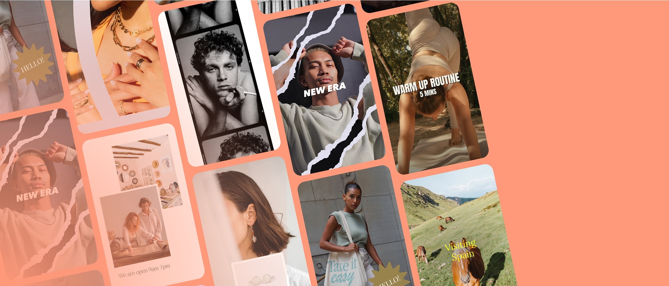
Mojo app allows users to create incredible Reels, TikTok videos, Stories, and social media. It has over 700 unique animated templates, hundreds of text styles, dozens of editing tools, AI tools, and so much more.
When I joined Mojo as Head of Design, the brand identity was nowhere near the excellency of the product and the website didn’t reflect any of the company’s values and culture. I refreshed the logo, designed a new brand identity and created the website.
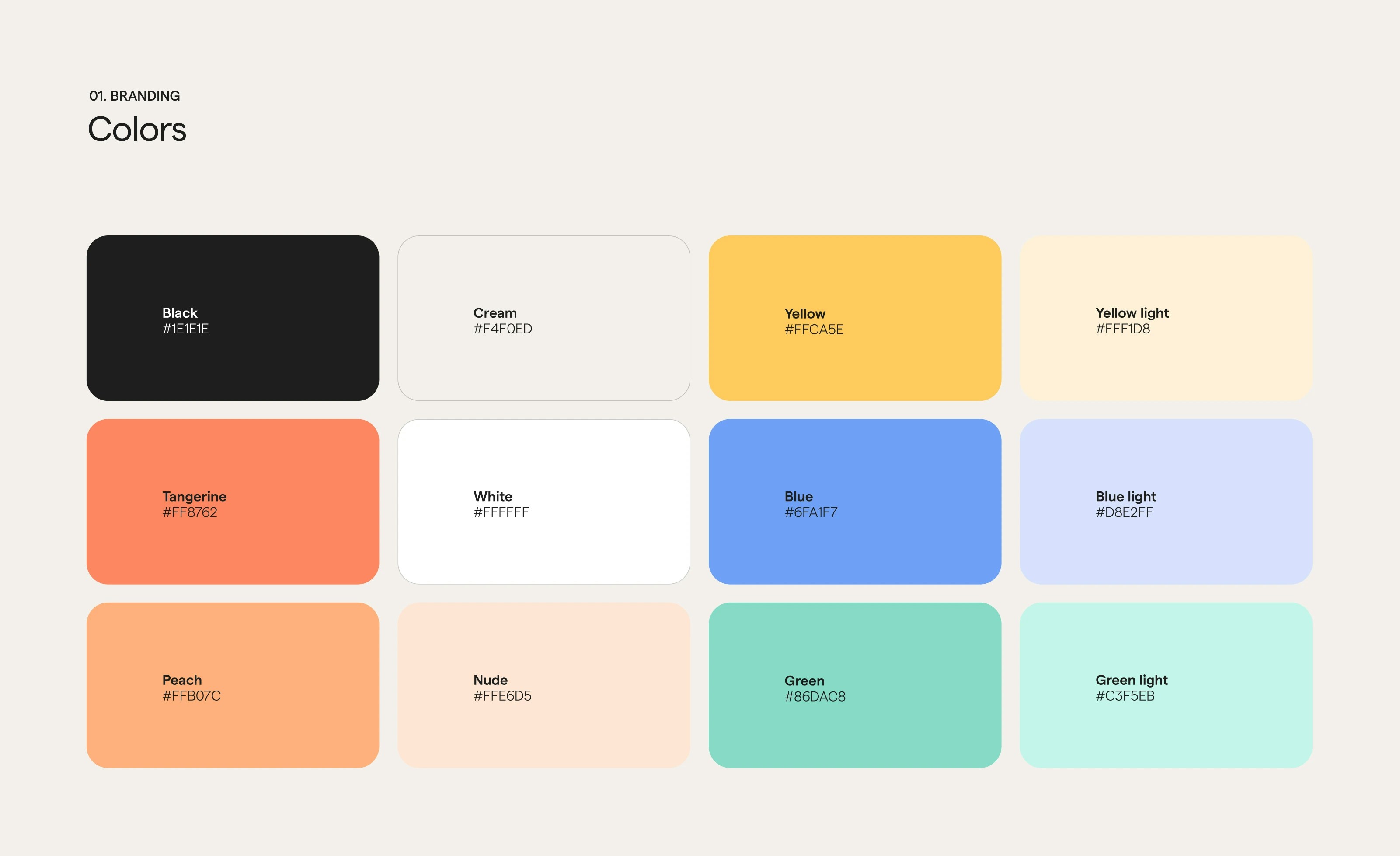
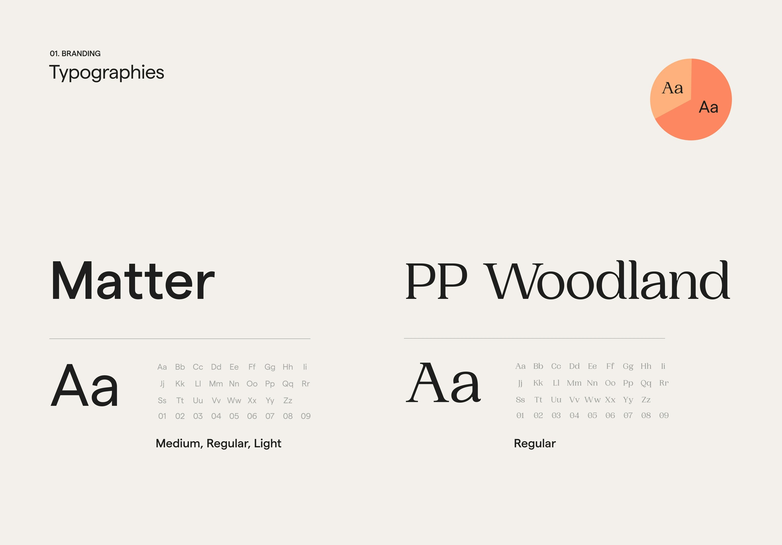
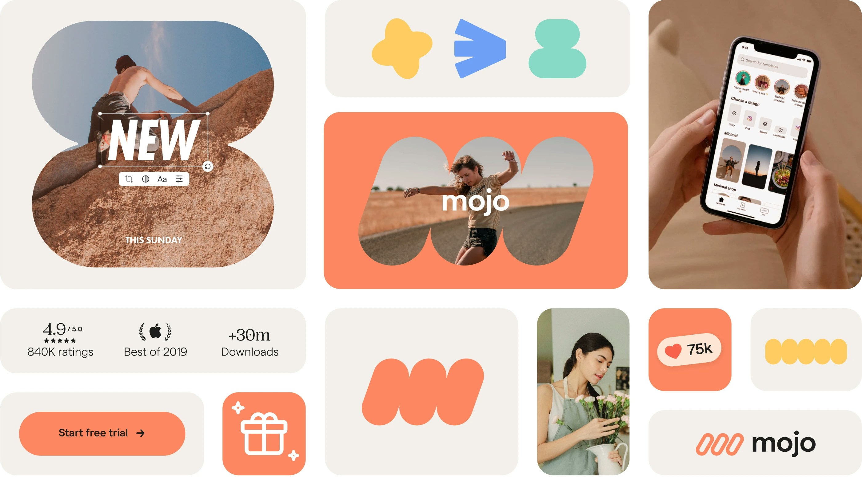
Establishing the foundations of the Mojo brand began with developing the color palette and selecting an additional typeface to enhance its personality.
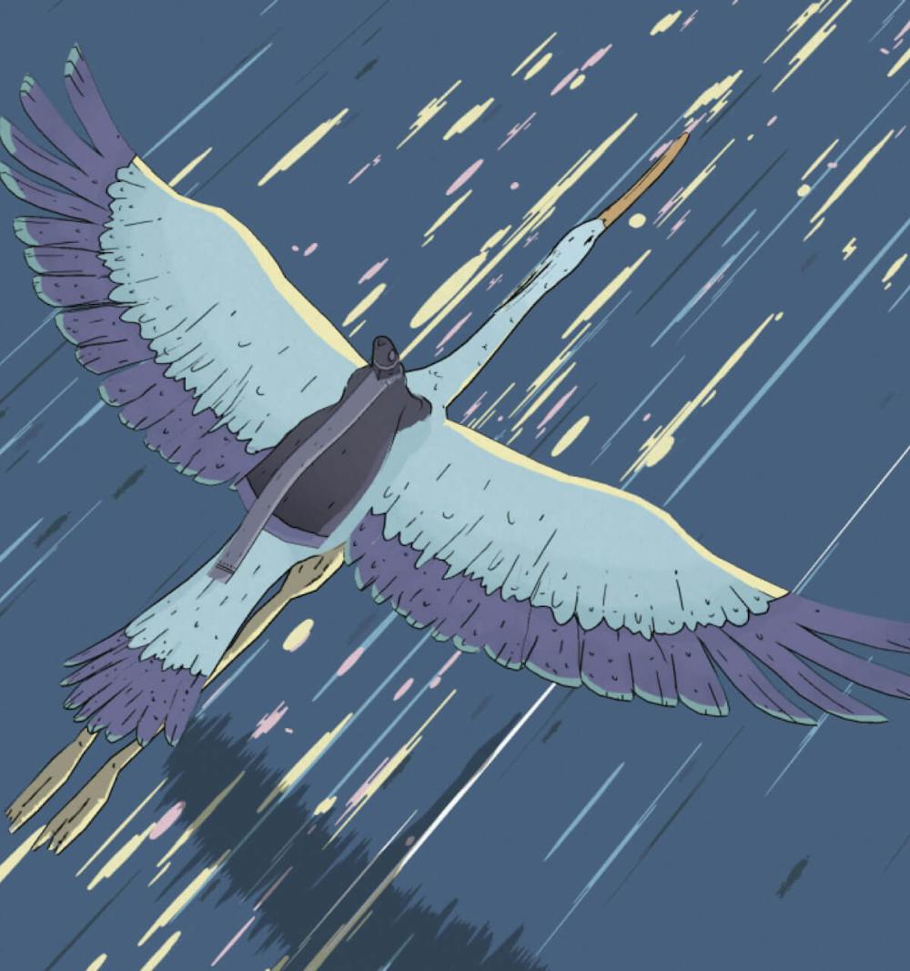
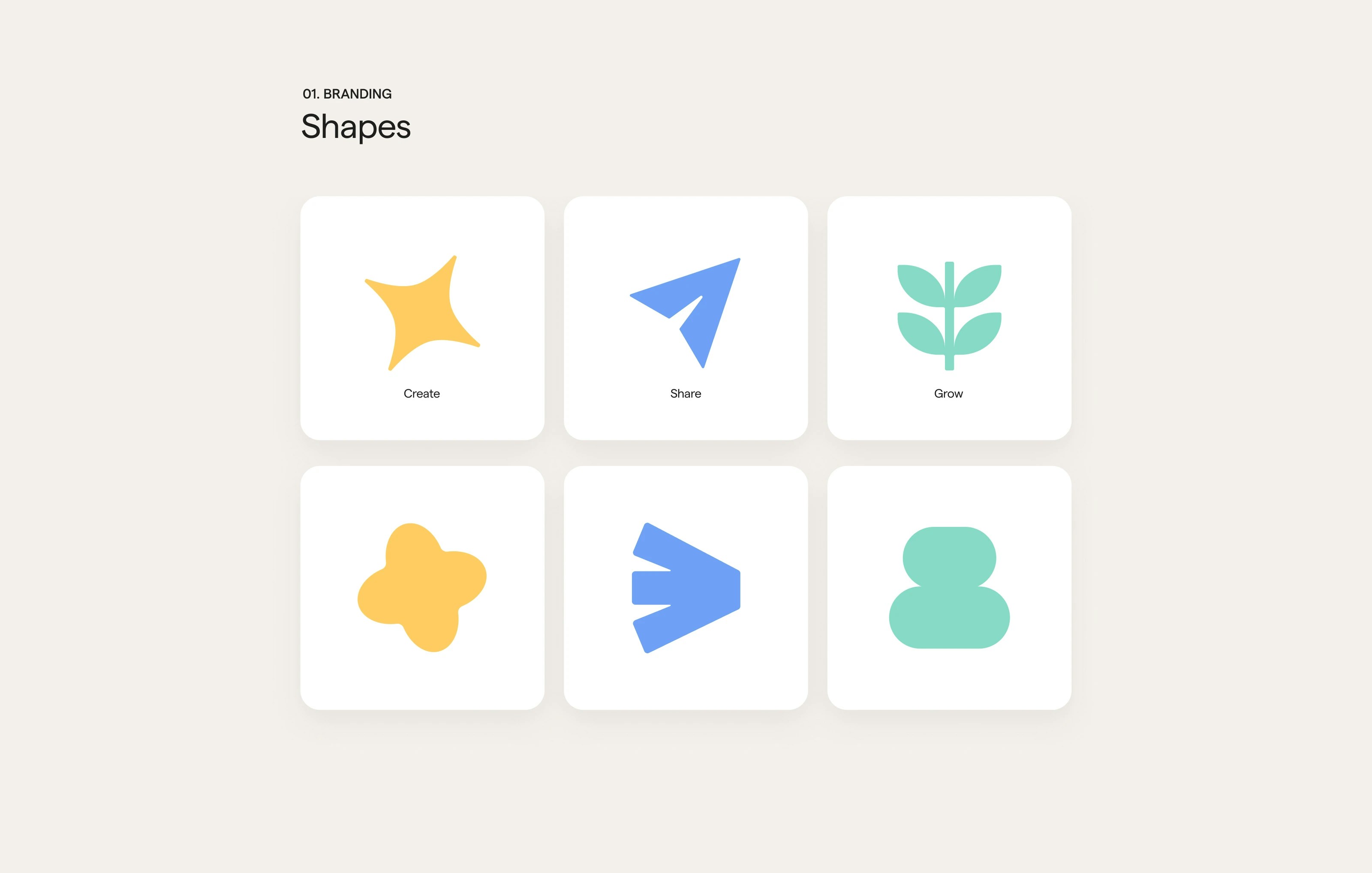
Analyzing the app's primary objectives and user actions, I identified three key concepts to shape the brand identity: create, share, and grow. These concepts were brought to life through playful shapes.
A looping animation of the brand shapes is used in various use cases on the website and in the app.
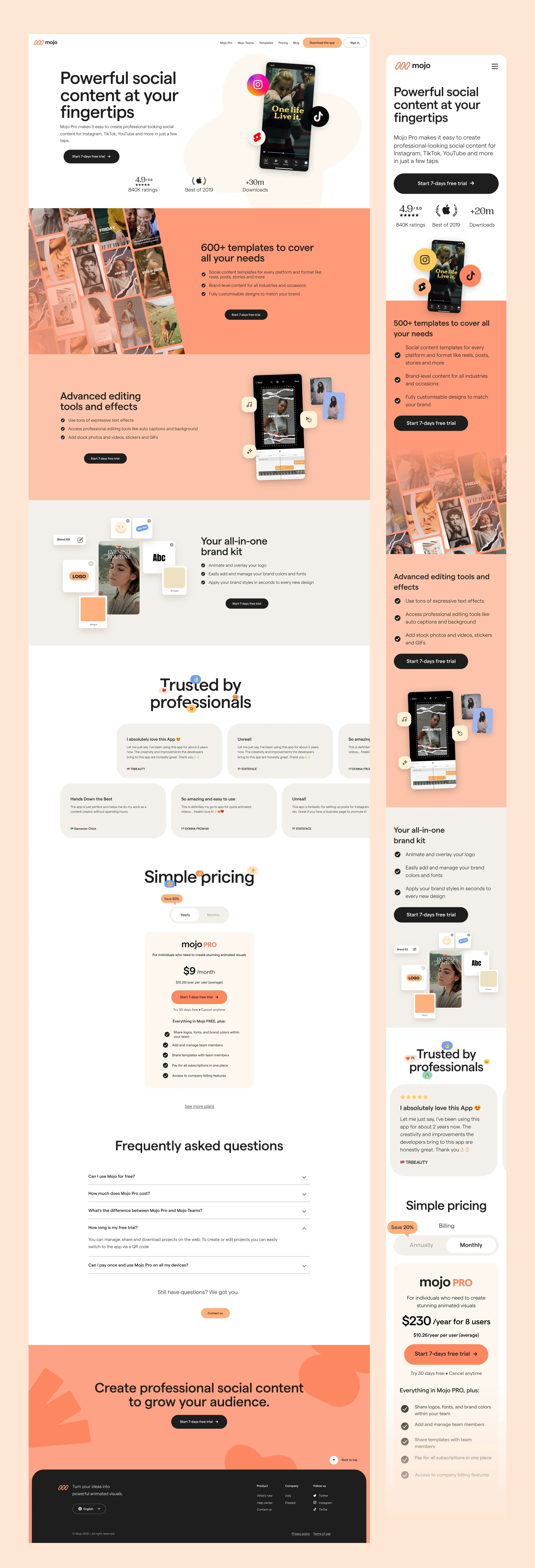
While defining the brand identity, I developed Mojo's website to test and refine the key concepts and visual language. The brand's shapes were incorporated as graphic accents, adding a sense of playfulness and animation.
I teamed up with Kolin Weidmann, a talented developer, Manon Jouet, an amazing designer and Philippe Neveu, a great motion designer to support me in creating the entire experience.
Specific modules use micro-interactions to invite users to interact and understand the product. The design challenge was to show the human-centric approach of the company despite being heavily tech-based.
Specific modules use micro-interactions to invite users to interact with and understand the product.
The design challenge was to show the company's human-centric approach despite being heavily tech-based.
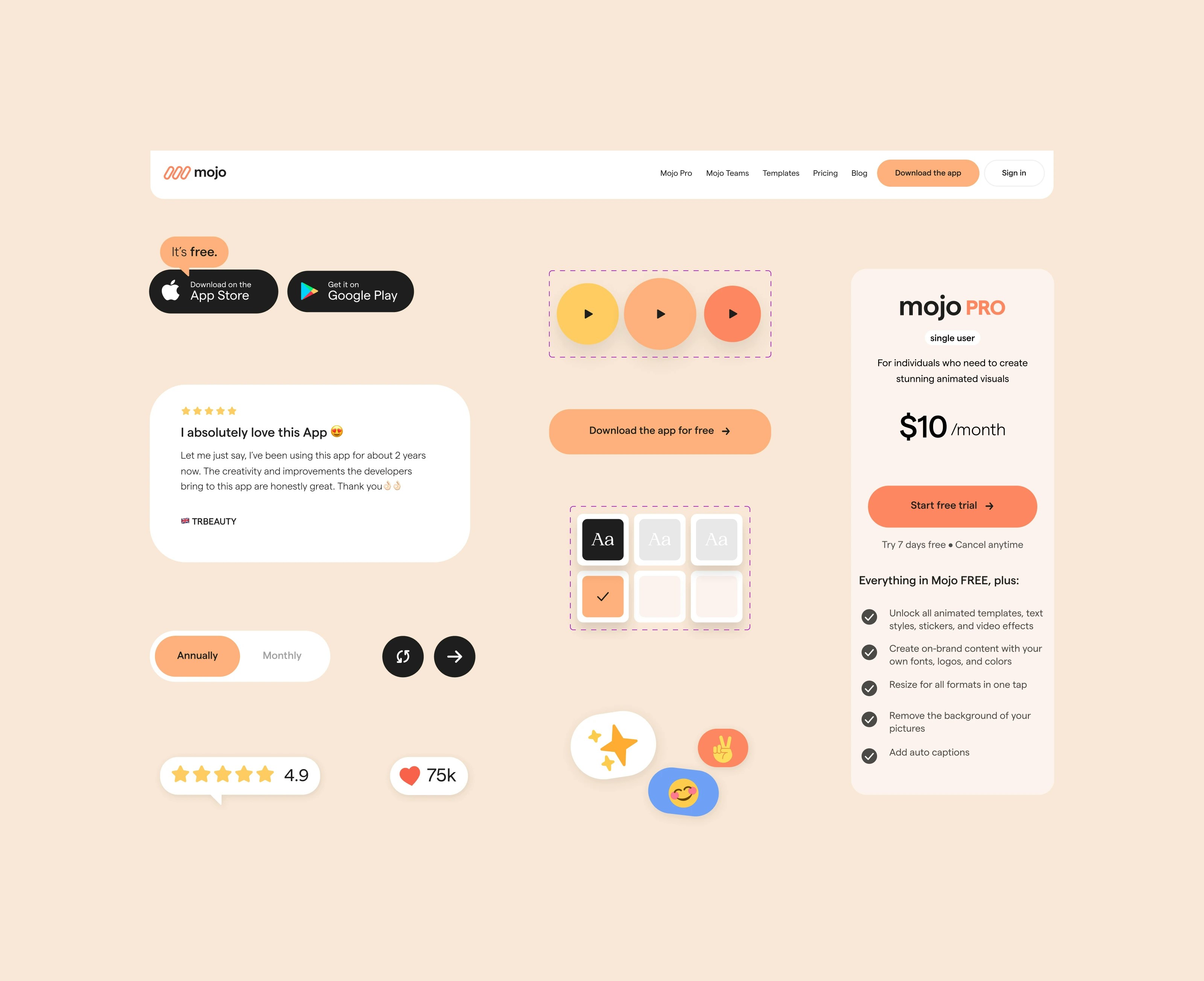
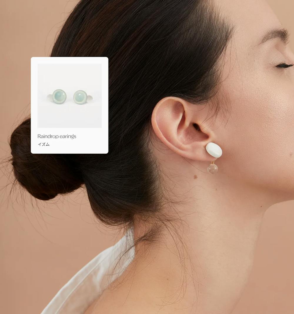
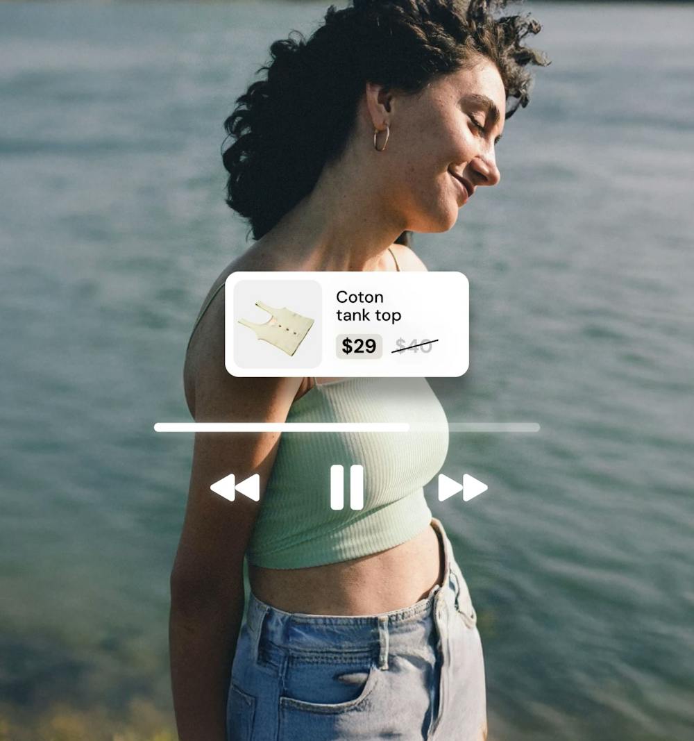
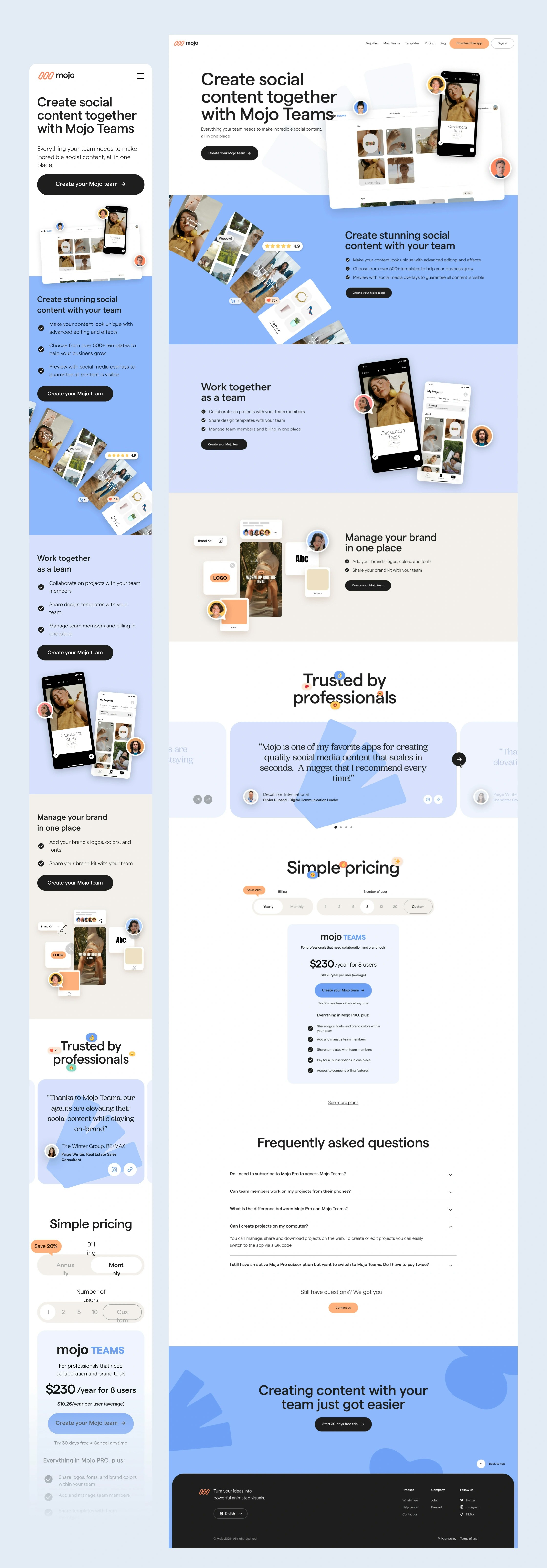
The Mojo website showcase the 2 subscription plans of the product through playful feature pages.
Mojo Teams is designed for small businesses to collaborate as a team and create visual guidelines within the app.
Animated visuals were used to help users easily grasp the key features of each plan.
To ensure accessibility across all locales, they were designed without text, making them universally understandable.
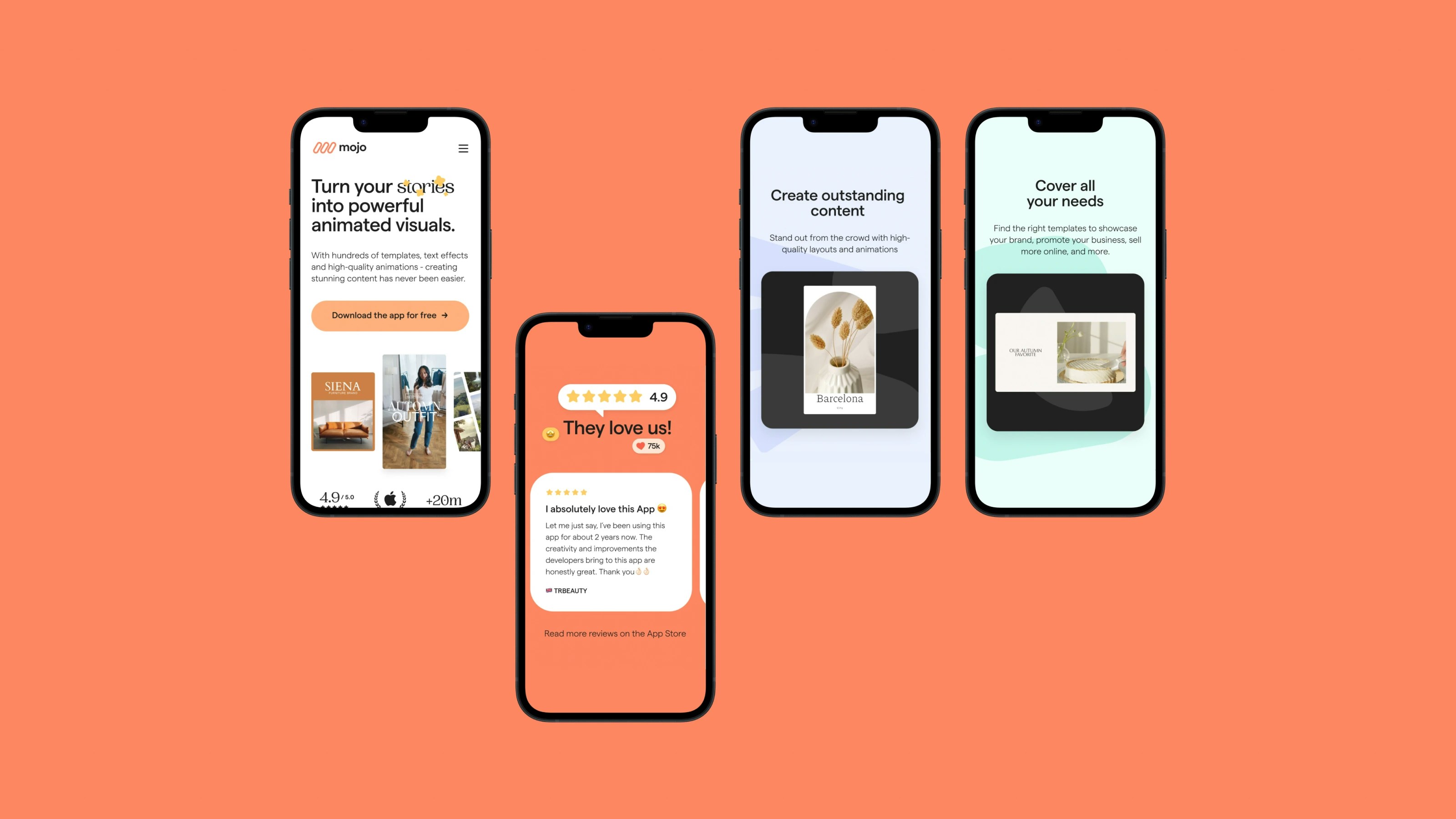
Making sure the branding was consistent across all the channels, including the app, was very important.
I revamped the app's paywall to align with the new brand identity. By incorporating immersive and meaningful animations instead of a traditional image slideshow, I significantly improved the conversion rate for new users.
Through a series of user tests, I iterated to refine the product features and animations for this element.
I was also in charge of creating an internal visual studio and hire a team to conceive, create and develop new concepts of animations, templates and visual elements for the app.
I created a separated case study page to showcase this area.